
Client Background
Posa's tamales are 100% handmade from a treasured family recipe, and the business has grown well beyond its Santa Fe restaurant. Posa's supplies local restaurants and markets throughout Northern New Mexico, ships tamales to customers in other states, and caters events of all kinds.
All of that needed to live on one clear, welcoming website, without losing the character that has made the brand a local institution for generations.
Project Scope
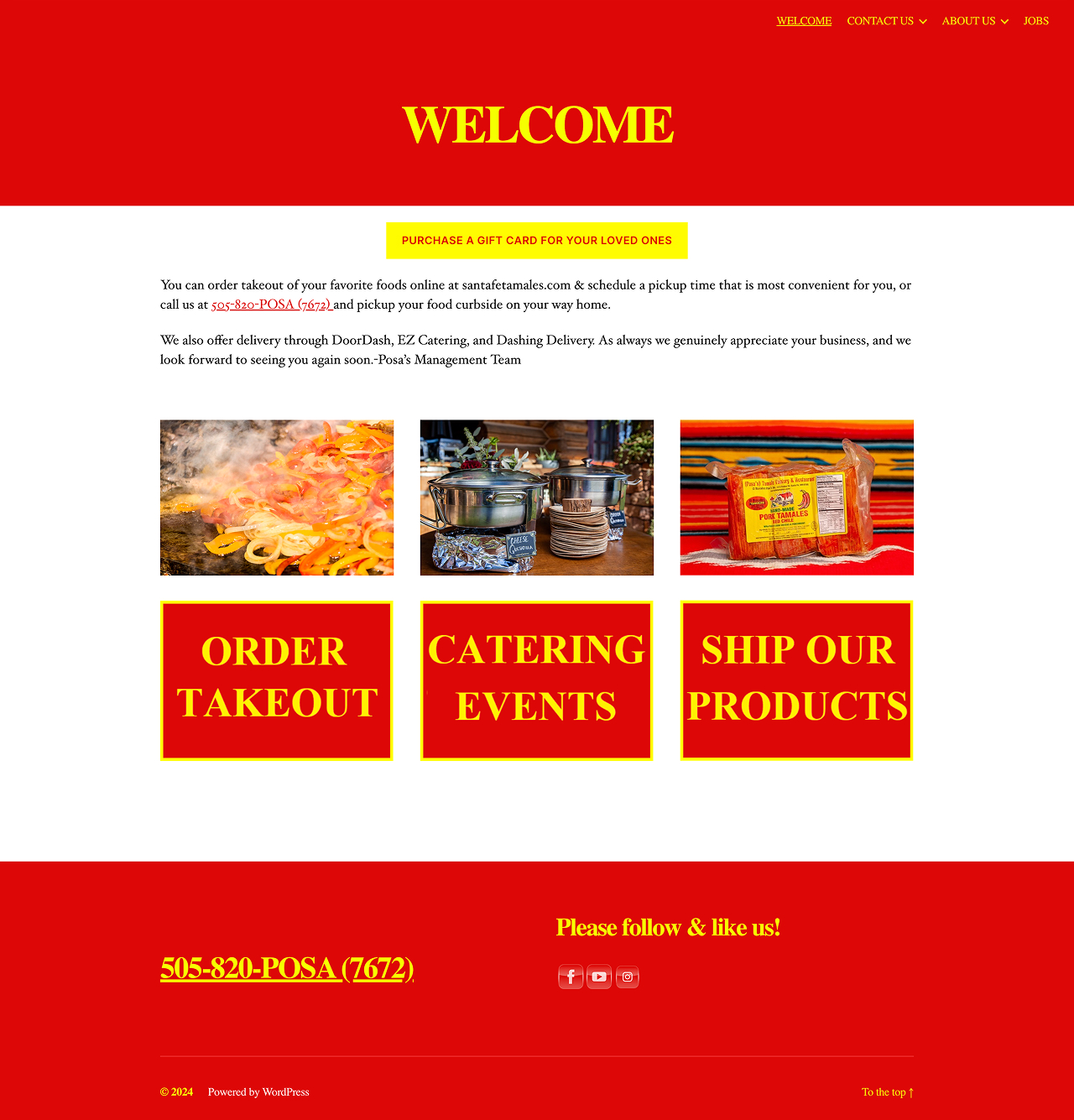
- Brand-first redesign: We kept the existing logo font and the Tamale Man logotype for instant recognition, and used a warm, inviting palette inspired by traditional New Mexican colors.
- Clear paths to every service: The site presents dine-in, takeout, delivery, online ordering, catering, food shipping, wholesale, and gift cards, all within easy reach from the main navigation and homepage.
- Heritage storytelling: A timeline of milestones from 1965 to 2024, plus history, team, and food information pages, tell the family story.
- Built for ease: Daily specials, a full menu, a blog, and a contact form with topics for General, Shipping, and Catering questions make it simple for visitors to find what they need.
- Trust and community: Customer reviews, social links, a "where to find Posa's" distributor list, and a newsletter sign-up help build confidence and keep customers connected.
- A dedicated wedding catering page: Instead of simply reskinning the existing site, we created an event-specific experience with its own look and feel. It stays warm and recognizable, with a custom variation of the Posa's logotype, hand-drawn just for it.
Gallery
Looking for a Similar Solution?
This case is just one example of how we help clients solve business challenges through thoughtful design, development, and automation. Let's discuss how we can support your project.