
Client Background
Orbi is an early-stage startup building a mobile-first app to help people stay meaningfully connected with the relationships that matter most to them. At the project's outset the product didn't exist yet — the client came in with a thorough design questionnaire describing the feelings and personality they wanted their future app to evoke, and needed a foundational branding kit that would guide all future application design work.
Project Scope
Phase 1 — Design Contest.
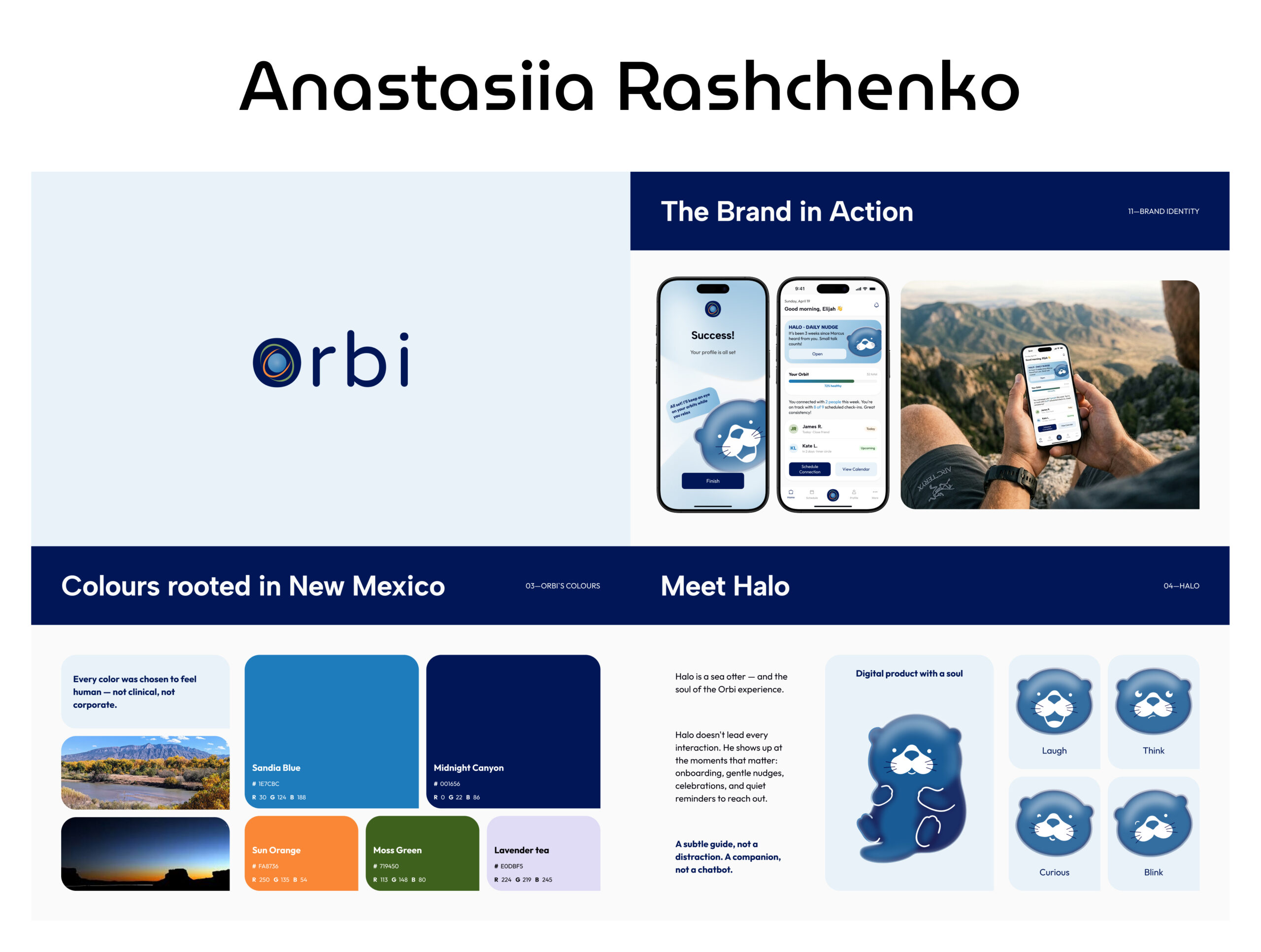
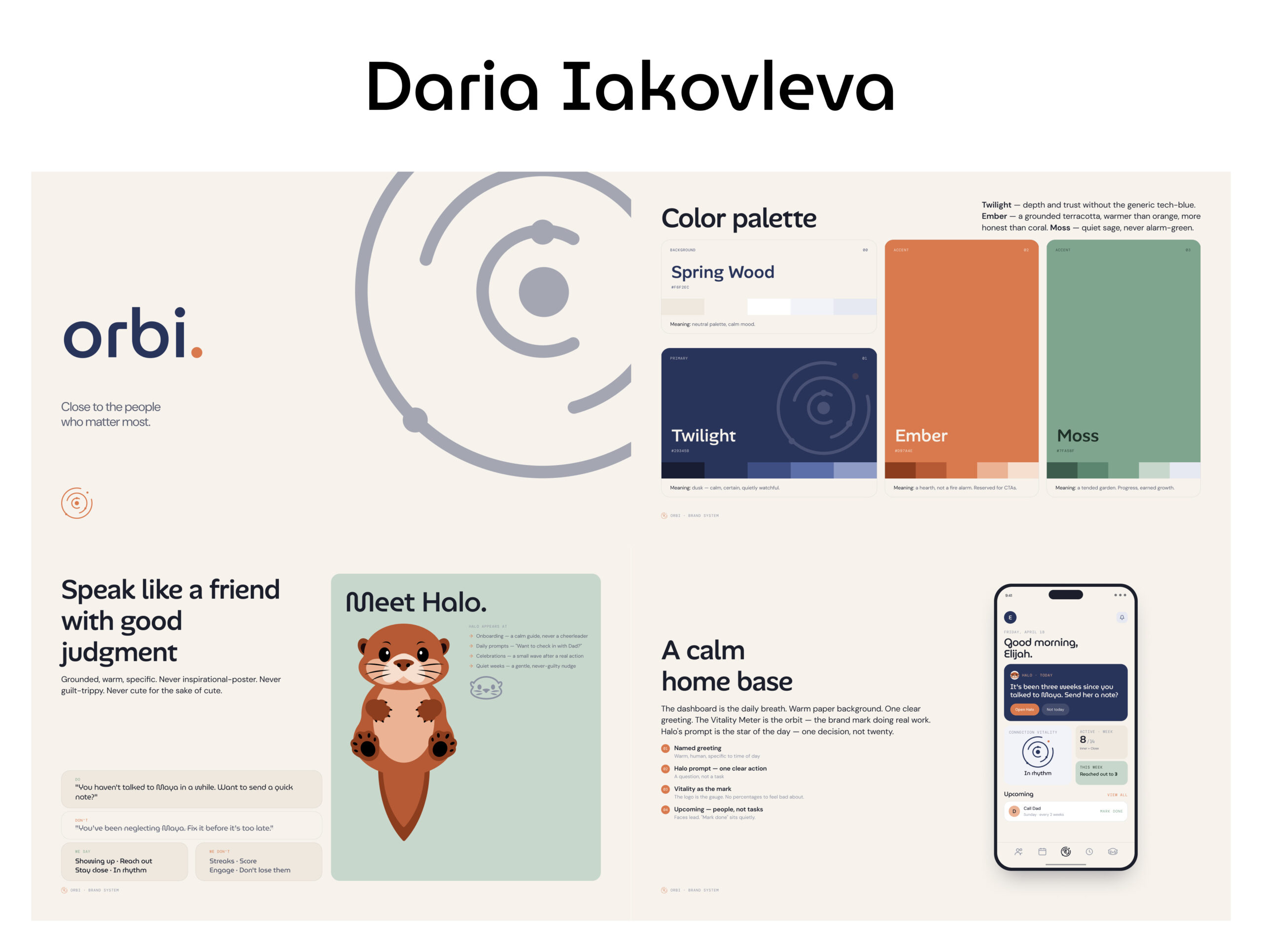
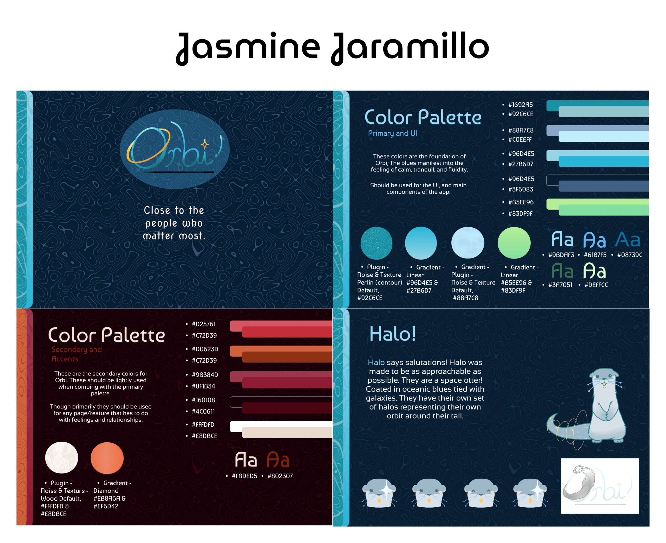
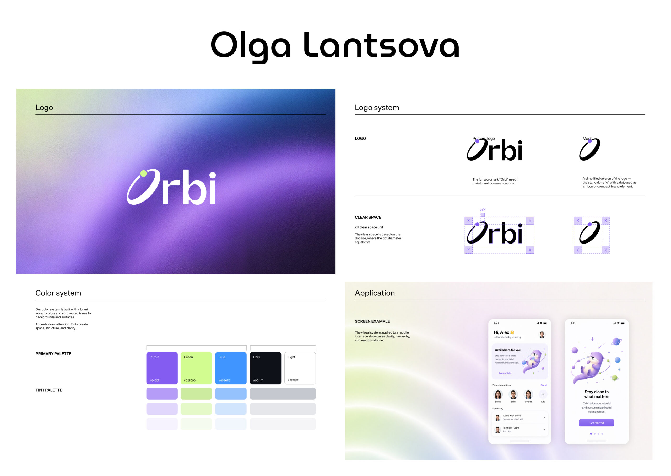
We organized a competitive brief and worked with four designers, each tasked with developing their own independent brand concept for Orbi. All four teams presented their work in a joint session with Noventum and the client, covering identity direction, visual language, color approach, and overall personality. The client evaluated each concept and identified the strongest elements across all four — certain directions for the logo, specific color instincts, typographic choices, and tonal qualities that resonated most.
Phase 2 — Synthesis and Delivery.
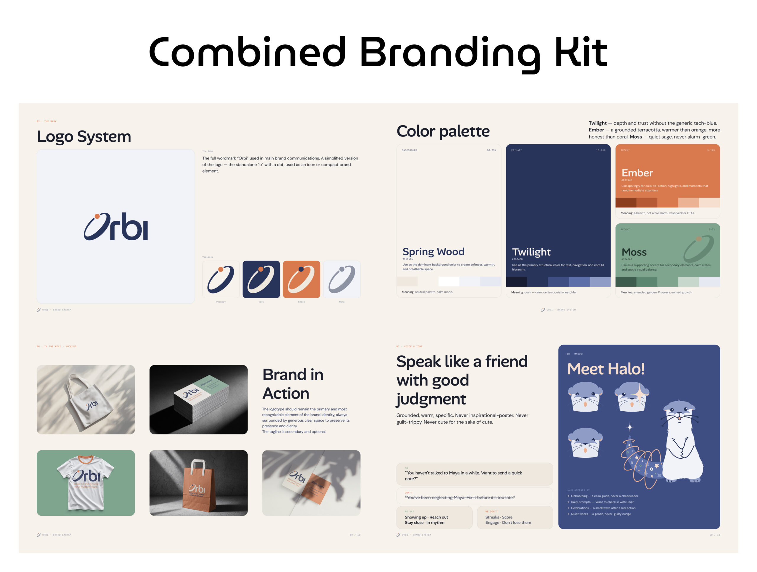
We took the client's selections and combined the best of all four concepts into a single, unified brand system:
- Defined the brand essence and guiding principle — "design for approach, not avoidance" — translating the client's choices into a clear emotional direction: human, intentional, and connected, never guilt-driven or pressuring
- Created a logo system: a full "Orbi" wordmark plus a simplified standalone "o" icon mark, delivered in four variants
- Developed a four-color palette — each color with defined usage ratios and intentional meaning
- Built a four-tier typography system: MuseoModerno for the logo, Alan Sans for headings, DM Sans as the primary UI font, and DM Mono for accent details
- Established photography guidelines emphasizing authentic, candid human moments over polished stock imagery
- Applied the identity across real-world mockups — business cards, tote bags, apparel, and packaging
- Wrote voice and tone guidelines with concrete do/don't examples to keep all messaging warm and supportive rather than gamified or guilt-based
- Designed an original brand mascot, "Halo" — a calm otter character appearing at onboarding, daily prompts, milestone celebrations, and quiet check-in moments
- Delivered a complete 10-page brand system document, presentation-ready for ongoing reference by the client and future design teams
Gallery
Looking for a Similar Solution?
This case is just one example of how we help clients solve business challenges through thoughtful design, development, and automation. Let's discuss how we can support your project.